
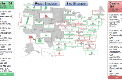
‘ The real-time map is a simulation, providing a qualitative view of births and deaths.
“[The map] can apparently seem to evoke a strange mixture of emotions,” Lyon, the map’s creator, said. “At least for me, it is a bit overwhelming and sobering, and provides some perspective on how big 300 million+ really is. However, if the rates and population counts are correct, something like this is actually happening as I type this. It\s just weird.” ‘ (PolicyMic).

